Tuesday, May 6, 2008


The brochure assignment was not difficult yet deciding the layout took some time. Once we found the information that we wanted to include into the brochure next we laid it out and fixed the images in Photoshop before including them into the final project. We had to make sure the the information looked good and was the right spots, as well as broken up accordingly. We got lucky printing the brochure because it ended up coming out in the right direction the first time. Overall this project was helpful in case I ever need to create a brochure for a business or project in the future because before this I would have used a word template which is no where near as professional.

Monday, May 5, 2008

newsletter


The RIFF newsletter assignment was not too difficult. Deciding where to put the text on each page and each picture was the most frustrating part. Once the text was placed and the pictures in the right spots, wrapping the text was next. Normally I would not be able to figure this out but the handout in class showed how to accomplish this. Playing around with the fonts and columns was fun, but deciding on colors took a while, because we wanted to created an equal balance between text, images, and color. Overall I think the newsletter turned out well. We included the information about the film festival, how to enter, as well as an application form for the 2008 event. We used Big Caslon font, because it was stylish yet not to complicated, and colors that seemed to match the title color which was red.
I think the newsletter was a valuable assignment because in the future we may need to create one for our jobs. Learning how to put things in columns and wrap the text even made it look somewhat professional.

Sunday, May 4, 2008

Bind In Cards


The three bind in cards were the hardest assignment for this course. Trying to make everything exactly identical to the original card was the hardest part. It seemed that every time I moved something, something else got messed up.
In Design was the easiest application to use. Moving the text around and making the magazine picture and title was not as hard as the other applications. Making the shadow on the picture and getting it to not be blurry was the hardest. I had to find the smallest picture of the magazine in Google, so that the resolution would not be blurry. Overall I like my In Design bind in the best.
Photoshop was the next easiest, but still difficult. Since we have not used it in a while it was hard to re adjust to using layers. Finding something as simple as a line took me a while to get u used to, and the size of the actual card took time as well. The filters were easiest in Photoshop, but fixing the text and line size was definitely the hardest.
Quark was the hardest application to use. Only having used Quark for the poster, and the bind in card being the hardest project so far, the two factors together did not work very well. In general Quark is just not familiar.

Thursday, April 3, 2008

Concert Poster


The concert poster was one of the easiest assignments we have completed so far. The picture was originally blurry so I used a film grain filter to hide that. Once the picture was all set I inserted the text of the artist, dates, and ticket prices. The background of the picture had black in it, so I had to use white text so it was readable, and move the text around many times to get it to work. I made the font that read "Cascada" more bubble like text than the other words, and put it down the side of the poster for a different effect. I bordered the poster as well as made the background pink to highlight the words and picture.

Wednesday, April 2, 2008

Design Rationale-Kiosk Powerpoint


For the Kiosk PowerPoint and sound slide presentation I chose Cascada, a German based techno band. I chose them because my original idea was taken, and I like their songs. Getting the pictures to not seem blurry or distorted in the PowerPoint was the first problem I came across. I had to put filters on certain images to rid them of the stretched look. I chose pink, blue, and black for my main colors, because techno music usually incorporates a lot of colors and lights. I played around with the entrance effects based on the information presented in each slide, and tried to make each slide visually pleasing. I would put more intense effect on a word or phrase if I wanted to show it off more than other items on the slide. For example on the website slide, I used the wave effect to show the actual web address show up, after a screen shot on the actual website came down. For fonts I tried to stay simple, but choose fonts that would look good and emphasize the information correctly.
The hardest part of the slide show was the timing. Making sure each slide was long enough for all the effects to come out and be shown took a few tries. Changing the music files from MP3 to WAV to back to MP3 was also a bit challenging at times. Overall this assignment was fun to play around with and I was happy with the final product.

Wednesday, February 20, 2008

Contact Sheet


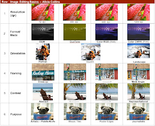
The contact sheet was a good project to learn how to use photoshop and all it's tools. For the first row I used a flower with a lot of close detail, so when changing the dpi's it could be seen. At first this was hard to get the dpi numbers to fit the size of the picture, then fit the picture in the box. It is cool to see the different quality of each column.

For the second row I chose a bridge because of the pretty view. I thought this was the easiest row, because once i figured out how to fit each picture in the box, changing the modes was just a click away. DuoTone was somewhat difficult due to it being a multi-step process.

For the third row I chose people climbing a mountain, because the example sheet had people in a setting. The portrait part of this row was the most difficult due to it being blurry at times.

The fourth row was framing, and the most interesting to me. Changing the angle each time, then looking back on all the columns, you can really see the different perspectives of the store front sign that i chose, as if you were really standing in different spots.

The content row was the second most interesting. I chose a beach chair by the water. I figured a picture in a setting with an object in the picture would work best, like the examples boat and bench.

The last row was purpose and simple. I used a pug, because that is my favorite dog, and it had many wrinkles in the face which could be seen as the columns changed. I then randomly selected different ways to change the look of the picture.

This project was overall a good chance to experiment with photoshop and learn different styles of filters.

Wednesday, February 6, 2008

Font Poem Assignment


“It’s amazing the clarity that comes with psychotic jealousy,” from the movie My Best Friend’s Wedding, is the quote I chose to use for the font poem. I chose this quote because it is one of my favorite movies, and I think the quote is quite true. In the movie the main character is jealous of her male best friend who is getting married and does crazy things to stop the wedding. Acting crazy because of pure jealousy makes a person see the reality of the situation.. In real life relationships jealousy usually snaps someone into realization that it is not the right situation for them and the emotion of jealousy can be dangerous.

For the fonts and styles of each word I tried to match it with the feeling people get when it is said, specifically pertaining to the quote. For the words such as it’s, the, that, and comes, I used the default font Myriad Pro and kept the font at size 20 to not over power the other words. I faded these so-called extra words into the background so they did not prevail by using the gradient overlay and the satin blending tool. For the word amazing I decided to capitalize all the letters, use the font Rosewood std for the hollowness, and use the blending tools bevel and emboss, outer glow, gradient overlay, and pattern overlay with a galactic pattern that really emphasizes the word showing how great it is. I cut up, and cropped a starry picture from google and added stars to really make the word pop out. The word clarity had to look very simple and clear so I used the font Andale Mono at size 24 so it was bigger than the extra words, but not too prevalent. I spaced the letters out to make it look cleaner, bevel and embossed it, and overlaid a pattern that was a sky theme to make it seem serene. I felt that the word with brought the clarity together with the jealousy. So I used an outer glow with a default font size 24, and alternated the colors blue and red to show both clarity and jealousy coming together for that realization. The word psychotic was the easiest. I placed a picture of a straight jacked behind the word and changed the opacity so it was in the background. I kept the default font but warped all the letters to look crazy and “psychotic” like. Lastly I put jealousy in size 18 in a Zapfino font. This font is cursive like, looks sly, and just makes the word scream jealousy. I finished with an outer glow, red font, and painting a red brush around the glow to accent it. When people think jealousy who does not think red?

I arranged the words amazing and clarity in the same row because I thought they complimented each other because it is the clarity that is amazing. I then stepped down the next three words to show a change that something seemed to be coming. Psychotic and jealousy were the last words being spaced out so they each stood out in their own way as strong words.